


TradingView provides you with one of the most advanced and dynamic platforms to see the price movement of the various financial instruments traded on the different stock exchanges across the world. The price and volume of trades are shown in the chart format making it easier for the users to understand the price movement and current trend in the stock.
Also Read: Importance of Volume in Technical Analysis: Use & Role in Trading
To interpret the stock price movement or identify the trend in the stock market or any other financial instrument you have to understand the chart structure TradingView. There are different types of charts used in TradingView to show the price movement, and different types of traders or investors use the chart as per their understanding and feasibility.
Also Read: How to Set Up, Adjust, Save, Clear, Reset TradingView Chart Settings
Different charts show the price and trend in different patterns, and the entire chart structure shows the trend in the stock or market that you need to understand. To understand chart structure trading view you have to know about the different types of charts and which types of charts are most useful or easy to understand. This article is all about the types of TradingView charts and how to understand chart structure TradingView explained with examples.
TradingView Chart Types
In TradingView software there are more than 20 types of charts that you can choose to watch the price movement of stocks. Though, most of them are not user-friendly or complicated to understand or everyone you can choose the best one that is most widely used by traders. The most popular chart construction is based on time and the construction of other charts depends only on price changes that you can choose as per your trading strategy.
Technical Charts Based on Time & Price:
- Line
- Bars
- Area
- Candlesticks
- Columns
- Hollow candles
- Step line
- Baseline
- Line with markers
- High-low
Technical Charts Based Only on Time:
- Heikin Ashi
- Renko
- Line break
- Kagi
- Point & figure
- Range
All these are the types of charts you can find in the TradingView software. All the charts have their own criteria and patterns to show the stock price movement. Understanding and interpreting each chart is not possible or not useful for anyone. You need deep technical knowledge and experience to understand the patterns formed in these different charts.
Also Read: Why is Fundamental Analysis Important for Investing in Stocks
Each chart pattern shows information on price movement with the trend and possibility or trading opportunities that you need to understand and analyse with the help of various tools and technical indicators given in the TradingView charts.
Not all the charts but you need to know about the top best and most popular or widely used TradingView charts that you can understand and analyze to make the right decisions for trading. Here below we have discussed about the best charts in TradingView and how to understand TradingView charts explained with the chart examples of market indices or stocks.
TradingView Chart Example
Line Chart
This is one of the simplest and easy-to-understand types of chart in the financial markets that you can also use in the TradingView. This chart is not only used by traders or market experts but also used by various types of people to represent the data about anything including the price movement of the financial instruments traded on the stock exchange.
The Line Chart is simply plotted with the closing price of the security or any financial instrument with the data points connected with each other creating a continuous line for a certain period of days or trading sessions. In this chart pattern, you can set the time period as the parameter that defines the time of a security closing price serving as data points.
While constructing the Line Chart only the “closing value” of the stock is considered and open, high, and low values are ignored. You can use this for displaying the price history of the stock and it’s less noisy as compared to candlestick or bar charts.
In a simple way, you can say, that the line chart provides a general view or price movement giving a clear visualization of the underlying trend in the stock from a medium to long-term point of view. However, the line chart is also considered an insufficient chart pattern to perform an in-depth analysis of the stock price movement and future predictions.
Also Read: How to Find Trending Stocks for Intraday Trading: Ten Rules
Bar Chart
While in the Bar Chart type, the time horizon is not considered, here the parameter that is considered is only the price range. When a bar chart is created each bar shows the high price for the period at the top and the lowest price at the bottom of the bar.
With each price interval, a new bar will be formed only once the prices pass the desired range. Each bar displays the open, high, low, and close prices (OHLC). The small lines on both sides of the vertical bar show the opening and closing prices of stock.
The opening price is represented by a small tick to the left of the bar and the closing price is shown by a similar tick to the right of the bar. This chart format allows us to completely ignore the time variable and only focus on the price movement reducing the market noise.
However, the chart will create the new bar only when the market is volatile and it will go down while the market is weak and consolidating during the trading session. If you can precisely set the desired price range you can get multiple insights while analyzing the bar chart for technical analysis. Compared to line chart format bar chart is more useful for analysis.
Candlestick Chart
This is one of the most popular and most widely used chart formats in trading in the stock market or any other financial instrument. In the TradingView chart, you can apply and use Candlestick Chart patterns for the in-depth analysis of stocks or the entire market.
There is only one parameter time period, the chart plots candlesticks and each candlestick is formed as a desired trading session passes. The candle contains the information on open price, high, low, and closing prices (OHLC) of a selected time period.
The rectangular shape of the candles is called the real body, and the shadows or wicks on the upper and lower sides are the high and lows respectively. While the upper end and lower end of the full body range show the open and close price of the stock.
A green candle means the close price of the stock is higher than the previous day’s close price, while a red candle denotes the close price is lower than the previous day’s close price. When the close of the session is lower than the open, it is considered a Bearish candle, and when the close of the session is higher than the open, it is considered a bullish candle.
For in-depth analysis, you have to thoroughly read and analyse the different candlestick chart patterns. The series of multiple candlesticks chart patterns shows certain price movements and indicates the next move of the stock likely to happen. However, for precise analysis and predictions you have to use the technical indicators that are plotted in the candlestick chart. For this, you should have the knowledge and experience to use chart patterns for trading.
Understanding Chart Structure TradingView
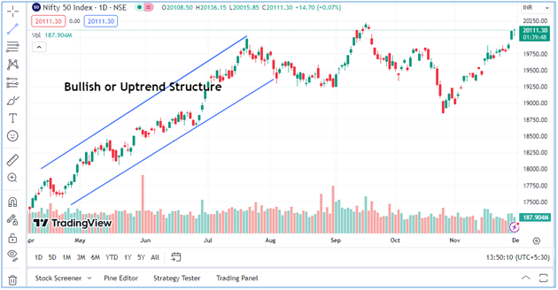
In TradingView, understanding the chart structure is one of the most important things to identify the trend and behaviour of the market or stocks. Simply you can say, it is the process of understanding how the market moves in different directions in different phases.
The market structure forms a series of price movements with swing highs and swing lows in different trading sessions. Traders use such market structure for swing trading and such trend in the market continues for a few days or trading sessions that need to be identified with the help of various patterns and structures that form and evolve during that phase.
Understanding the structure allows you to synchronize with the market and avoid making trading decisions against the market trend. Broadly there are only three types of structures in the stock market that are discussed below with the chart examples.
Types of Market Structures in TradingView:
- Bullish Market Structure
- Bearish Market Structure
- Range-bound Market Structure
Bullish or Uptrend Market Structure
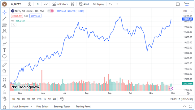
The Bullish market structure is visible when the market is in the uptrend or continuously moving in the upward direction. When the candlestick charts in TradingView are formed with new highs every day most of the candles are green creating a type of climbing the hills type of structure in the chart. You can see the image below showing the bullish market structure in which Nifty, the main benchmark index of the Indian stock market was in an uptrend from May 2023 to end of the Jul 2023.
The bullish market structure is characterized by the formation of candlestick chart patterns with higher highs followed by higher lows. To keep the uptrend intact, it must keep the ascending structure with higher highs following the higher lows.
Bearish or Downtrend Market Structure
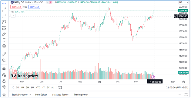
The bearish market structure can be seen when the market is in a downtrend and continuously moving in a downward direction. To identify the bearish market structure, you can see when the candlestick charts in TradingView software create the lower lows, with lower highs creating the downtrend market structure as the image given below.
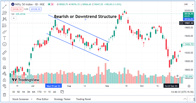
As you can see in the image above the chart of Nifty-50 in TradingView shows the bearish market structure. From end of the Jul 2023 to the start of the Sep the market was in a downtrend as most of the candles formed with lower lows and higher lows created a bearish trend in the market. In this type of market structure, the lower highs are considered if the price goes into compression or re-distribution to move further in the same downward direction.
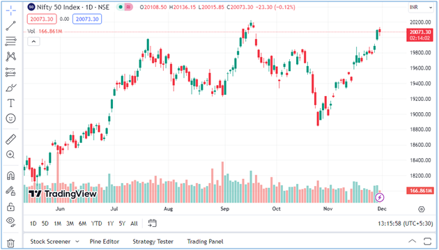
Range-bound Market Structure
This is also called the sideways market structure in which the market keeps trading in range for many days creating a limited trading zone for the traders. The market keeps trading between these two levels upper range and lower range for many trading sessions providing trading opportunities for short-term traders to buy and sell within that range.
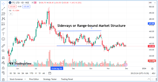
The size of the high and low range can depend on various factors like stock or market volatility, demand-supply and class of the assets. As you see in the image above ITC stock traded in the range-bound trajectory between Aug 2023 to the end of Oct 2023. This formation for chart patterns shows the sideways or ranging market structure for that period.
However, many times, the structure is not clear or can be confusing, unless the market either breaks down or breakdown to come out from this sideway trajectory. The end of this trend provides an opportunity for traders to create the long positions when breaking out and selling stocks or create the short-selling position when the market breakdown from the sideways zone.
Also Read: What is Long Unwinding in Stock Market: Is it Good or Bad?
Many times trading in a sideways market can be a challenging task for the traders, as the market remains choppy, or there is not enough room for the stock price to move either side. In such conditions, when price movement is clearer, some traders prefer to trade within the range by creating short positions at the high range and long positions at the lower range. Here, to make better utilization of such a market structure you can use the top technical indicators.
TradingView Chart Explained
Understanding chart structure TradingView is not difficult if you keep analyzing similar formations of charts and market structure and relate the same as per the movement of the market. A combination of different types of chart patterns in different market conditions can be analysed only when you are able to recognize the chart patterns and their structure precisely.
Undersigning the Chart Patterns: To understand the TradingView chart and market structure you should have knowledge of all types of candlestick chart patterns and trends created with the series of such charts that you can analyse for the next move of stock.
You will be able to easily identify chart patterns and use them in visualizing the market structure or the structure of stock price movement for certain trading sessions or sleeted periods. You have to identify the support and resistance using these chart patterns.
Understanding the Market Range: When you are able to identify the chart patterns, you have to understand the market structure that is created with the series of these candles. Suppose you have identified a series of high candles created in a range and when stock comes down from this point it becomes the resistance level for the same.
Similarly, when a series of low candles is created and most of the time market or stock bounces back from this level, it becomes the support level. These support and resistance levels create buying and selling opportunities for the traders, especially when there is a trend reversal or the market comes out from range it can become a bullish or bearish trend.
Also Read: Best Option Strategy for Bearish Market: 7 Option Strategies
Bullish Trend Chart Structure: As we have already told you when the candles form higher highs and lower highs with the trend continues for many days taking the market to the next levels, means the market structure is bullish. The bullish market structure creates buying opportunities for the traders, but only when they are able to identify the trend in the early stage create long positions at the same time and exit timely before the end of this trend to earn profits.
Bearish Trend Chart Structure: Just like a bullish trend, when the candles forming with lower lows and higher lows continue for many trading sessions, it means the market is in a downtrend. This bearish trend creates an opportunity for traders who believe in short-selling. They can earn only from such trades when they timely identify this trend to sell the stock and profit booking by short-covering before the trend ends or trend reversal starts.
Charts in Consolidation Phase: When the market is in the range-bound trajectory, and this comes when the market was in a bullish or bearish trend for many days, then this sideways trend is called the consolidation phase. This is the phase when there is not too much movement in the market, it keeps trading in a limited upper and lower range with low volume.
Also Read: Best Volume Indicators for Day Trading & How to Use for Intraday
The chart in the consolidation phase is created with a mix of green and red candles with the short wicks on candles showing the low volume in the market.
When there are no such events or news that can influence the market to move in either direction, then the consolidation phase keep continues. In such situations, traders keep waiting until the market breakout or breakdown from the consolidation phase.
Charts in High Volatile Market: Sometimes you can see there is too much noise in the chart patterns in the TradingView chart structure. This kind of candle formation and market structure is created when there is too much volatility in the market or stock price.
Understanding this kind of chart pattern precisely is very important to analyse the market and create any kind of trading position in the market. The high volatility index (VIX), shows the volatility levels in the market, and for intraday traders, it can be a wonderful opportunity but in a highly volatile market trading also becomes riskier if not traded professionally.
Also Read:7 Biggest Mistakes To Avoid While Doing Intraday Trading
In the highly volatile market, the candlestick charts formed with a mix of green and red candles having long tails or wicks showing the market moved in both directions during the day trading. In such a volatile market, the trend is not defined and traders just create the trade positions for the intraday trading and exit from their positions before the end of the day.
Also Read: How to Do Intraday Trading: Best Stocks, Charts & Strategies
In such market conditions, you should avoid trading, or take help from the market experts using the technical analysis and best technical indicators for intraday trading. These experts have advanced levels of trading software like TradingView charts to apply various tools and techniques to better analyse the market situation or stock price movement.
Also Read: Is Technical Analysis Useful or Useless or Enough for Trading
Moneysukh provides online trading and investment solutions with market experts who perform fundamental analysis and technical analysis to pick the best stock for day trading or for long-term investments. You can open your trading account and demat account here to enjoy the best online trading platform like Trade Radar for trading or investing in equities, commodity market and forex trading.
Also Read: Equity or Commodity which is better for Trading or more Profitable
Moneysukh is one the best discount brokers in India providing the trading and investing facility through Algo-trading software. Here you can choose from the best intraday algo trading strategy with the best algo trading platform and trading strategies at the best pricing. To start algo trading in Moneysukh you need to open the trading and demat account here.
Apart from enjoying the high-frequency trading through Algo-trading, you can also personally get advice from the market experts to buy or sell stocks, commodities or currency. The team of research analysts for technical or fundamental analysis works together here to generate useful reports and recommend the stocks for long-term investment. You will also get to know things before investing in stock market and various risks involved in trading and investing about the various other useful topics that help beginners to become a proficient investor in the market.
Also Read: Types of Risks Associated with Investing in the Stock Market


1 Comment
Great post! The breakdown of chart structures in TradingView was super helpful. I especially appreciated the examples you provided; they really clarified the concepts. Looking forward to applying these tips in my trading!